

PRINTING
Color Systems Explained
Your Blue and The Printer's Blue Have Never Actually Met
May 21, 2026 · 8 min read

You have a blue. You love your blue. Your blue looks incredible... on your screen.
Somewhere in your brand standards document, or in your designer's head, or written on a Post-it note stuck to a monitor in an office somewhere, there is a color. It is your color. Your brand blue, your signature green, your very specific shade of coral that took three rounds of focus groups or your family's feedback to land on. You love it. Everyone loves it. It looks perfect on the website, perfect in the email newsletter, perfect on every screen it has ever appeared on.
And then you print something.
And the color comes back looking like it went on a very long trip and made some questionable decisions along the way.
This is not a printing error. This is not the printer's fault. This is not a conspiracy, although we understand why it can feel like one when you are holding a box of 5,000 sales flyers that are the wrong shade of blue and the event is in four days. What it is, is physics. Specifically, the difference between color made from light and color made from ink. And understanding that difference is one of the most useful things anyone who ever orders anything printed can know.
We have been navigating this particular gap between expectation and reality for a very long time. Pull up a chair. We are going to sort this out together.
Four color systems walk into a room. They do not agree on anything.
Every color you see on a monitor, a phone, a tablet, or a television is made of light. Specifically, red light, green light, and blue light mixed together in varying amounts. This system is called RGB, which stands for exactly what you would expect. Crank all three up to maximum, and you get white, because white light is all the colors combined. Turn them all off, and you get black, because a screen with no light is a dark screen.
This is a beautiful system for screens. It produces an enormous range of vivid, luminous colors. Neon greens that practically vibrate. Blues so saturated they look almost electric. The reason your brand color looks so good on your website is partly because your website is glowing at you.
Print does not glow.
Print works in an entirely opposite way. When you print something, you are laying ink on a surface and relying on the light in the room to bounce off it and into your eyes. The ink absorbs some of that light and reflects the rest, and what gets reflected is the color you see. This system is called CMYK, which stands for Cyan, Magenta, Yellow, and Black. Mix all of them together, and you get something approaching black, because you are absorbing almost all of the light. Use none of them, and you get the white of the paper itself, because nothing is absorbing anything.
The key thing to understand here is that CMYK has a smaller range of possible colors than RGB. There are beautiful, glowing, electric colors that exist on your screen that simply cannot be reproduced with CMYK inks. They are outside what printers call the gamut. When a color conversion happens from RGB to CMYK, those out-of-gamut colors get pulled toward the closest printable equivalent, which is usually a slightly less vibrant, slightly more real-world version of the color you designed. Nobody is doing this to you on purpose. It is just how light and ink work.
Meet Pantone...It's Kind of a Big Deal
In 1963, a printing company employee named Lawrence Herbert decided that the print industry needed a universal system for talking about color. At the time, if you told a printer in New York that you wanted "blue," and a printer in Los Angeles that you also wanted "blue," you would get two different blues. There was no standard. Every printer had their own recipes, their own inks, their own interpretation of what a color word meant. It was charming in the way that chaos is charming, which is to say not very charming at all when you have a brand to maintain.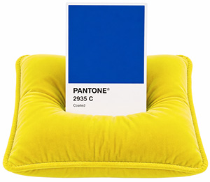
Herbert created the Pantone Matching System (PMS). Sure, he probably could have thought of a name with a better acronym, but regardless, his idea changed everything. The concept was elegant: assign a specific number to a specific premixed ink color, publish a physical book of those colors on paper, and make that book available to every designer and every printer in the world. Now, when a designer in Florida says Pantone 2935 C and I are in a committed relationship and I need this exact color on my packaging, a printer in Ohio knows exactly what ink to mix. No interpretation. No guessing. No "creative" blue.
That is what a Pantone color is. It is a premixed ink with a specific formula and a specific number. It is not built from CMYK dots. It is not converted from an RGB value. It is its own thing, printed in a single pass as what printers call a spot color, which means the ink goes on as one solid, consistent layer rather than as a pattern of tiny overlapping dots. The result is a color that is richer, more saturated, and more consistent than anything CMYK can reproduce. Especially for blues. Blues are notoriously difficult in CMYK and tend to lean towards a slightly purple hue if you're not careful. A Pantone blue does not have that problem. It is the blue. Every time. On every press. In every print shop that owns the book.
"We have seen what happens when a brand spends a year perfecting their blue on screen and then discovers at the press check that CMYK was never going to get them there. The Pantone book is not an optional purchase. It is a very reasonable insurance policy."
But wait... There is a C and a U, and they are not the same thing.
Open any Pantone swatch book, and you will notice that each color has a suffix. The C stands for Coated. The U stands for Uncoated. Pantone 2935 C and Pantone 2935 U are the same color number, which you would reasonably assume means they are the same color. They are exactly NOT the same color. Or rather, they are the same ink, but the surface they land on changes how the color appears to your eyes, and the swatch books reflect that difference so you can see it before you commit.
Coated paper has a shiny surface. The ink sits on top of that surface rather than being absorbed by it, which means the color stays bright, saturated, and crisp. Uncoated paper has no such coating, so the ink gets absorbed into the paper fibers, which diffuses the light and makes the color appear softer, a little more muted, a little warmer. Same ink, different surface, and genuinely a different appearance.
The hex code situation, which we should also address
A hex code is a six-character code, usually preceded by a hashtag, that tells a screen how much red, green, and blue to mix to produce a color. #0047AB is a nice blue. #63CAEB is a very nice blue, which we may or may not be personally familiar with. Hex codes are exclusively for digital applications. Websites, apps, social media graphics, email templates, anything that lives on a screen and is made of light.
A hex code cannot be printed. Not directly. Not usefully. When someone sends us a hex code and asks us to "match it" in print, they are really asking us to find the closest CMYK or Pantone equivalent to a color designed in the language of light and translate it into the language of ink. That translation is possible, and we do it regularly. But it is a translation, not a copy. The result will be close. It will not be identical. And for some colors, particularly those bright, saturated ones that live comfortably in RGB but strain against the edges of the CMYK gamut, close is doing a lot of work.
The solution is to start with Pantone when color accuracy matters. Choose your brand colors from a physical Pantone swatch book held in your hand under the kind of light you actually use. Then derive your CMYK values from that Pantone color using a Color Bridge guide. Then derive your RGB and hex from that. Not the other way around. Of course, all of this matters a great deal more when people can actually find your brand online. That's kind of important too.
THE ORDER OF OPERATIONS THAT SAVES EVERYONE TIME
Pantone first, CMYK second, RGB and hex third. This is the direction the color should travel if you want it to be consistent across print, digital, signage, apparel, and everything else your brand touches. Going the other way, from a hex code backward to a Pantone, is like translating a poem from English into French and then into Mandarin and then back into English and being surprised that something got lost.
Your brand standards document should contain all four. Every time, without exception.
When Pantone is not in the budget and CMYK is doing its best
Spot color printing with a dedicated Pantone ink is not always the right call. If your print job has photography or gradients, you are already printing in CMYK because spot color does not do those things. If you are doing a short digital print run, the press may not even have spot color capability. If your brand color happens to fall within the comfortable range of what CMYK can reproduce, you may not need Pantone at all.
In those cases, the key is knowing what your CMYK build actually is before you go to press, running a printer's proof, and comparing that proof to your brand colors under consistent lighting before approving the job. Not on your phone, not on your laptop, a physical proof. This is the step that gets skipped most often and causes the most surprised phone calls. If your printer can output a physical proof on your actual paper, even better! You may be amazed at the huge gamut of color ranges there are, even for just simple white paper. Some have more blue tones, some have more yellow... all of which can have a tremendous effect on how your final printed pieces look.
For jobs where color is critical, we go further than a proof. We attend press checks. That means someone from our team is standing at the press when the job runs, Pantone book in hand, comparing the live output against the approved standard before a single full sheet is committed to. It is the difference between hoping the color is right and knowing it is right.
We have caught color drift, ink density issues, and paper substitutions at press checks that would have quietly ruined entire runs if nobody had been in the room. It is not glamorous work. Standing on a pressroom floor under fluorescent lights, holding a swatch book while the press operator watches you squint through a jeweler's loop is not anyone's idea of a glamorous afternoon. It is, however, extremely satisfying work, and not just because we get to yell, "Stop the Presses!". It saves money in reprints and saves you from those deadline mishaps.
We always ask for a proof, every time. Not because we don't trust the pressman, we've known most of them for longer than we can remember. But, because ink on paper in your hands is the only thing that tells you what ink on paper in your hands is going to look like. Your monitor, however lovely, is a glowing rectangle and it has its own agenda.
One More Thing: Your Color Looks Different on Every Surface, and That is Normal
Even with a perfect Pantone spec, even with a perfect CMYK build, even with an approved proof in hand, your brand color will look slightly different on a gloss label than on a matte business card than on a kraft box than on a cotton tote bag than on a corrugated shipping box. The substrate is always a variable. The lighting conditions where the piece is viewed are always a variable. The age of the ink on press is a variable. The humidity in the pressroom on the day of the run is, somewhat absurdly, a variable.

This does not mean you cannot achieve beautiful, consistent brand color across different materials. It means that color consistency is something you manage actively rather than something that just happens. You specify thoughtfully. You proof carefully. You build a brand standards document that acknowledges the real-world behavior of ink and accounts for it. And you work with people who understand all of the above and can help you make the best decisions at every step of the process.
Your blue and the printer's blue can absolutely meet. They just need a proper introduction.
Color is one of the most powerful things in your brand. Treat it accordingly.
We have been helping brands get their colors right across every print medium for a very long time. Business cards and brochures, packaging and labels, large format signage, apparel, promotional items. Every substrate. Every process. Every time someone calls us in a mild panic four days before an event, we have a plan.
If your brand does not have a Pantone color specified, or if your color standards document is a hex code on a Post-it note, or if you have ever received a printed piece and thought "that is not quite right," come talk to us. Bring the piece that was not quite right. We will figure out exactly what happened and make sure it does not happen again.
And if you would like to see what Pantone 2935 C looks like in person, we have the book right here.
— The team at Triple e Digital, Clearwater FL. Print strategy, color management, press checks, and design that holds up across every medium. It's what we do.
