BRANDING
AN HONEST CONVERSATION
We Need to Talk About Your DIY Logo.
May 28, 2026 · 10 min read

The DIY Thing...It Shows.
(And we're calling ourselves out on it too.)
Nobody ever wakes up and thinks, "Today is the day I'm going to design a bad logo," and that is maybe the most important thing to say before we get into our whole DIY logo spiel.
You're starting a new business. The budget is perhaps a bit tight, and the giant, once-in-a-lifetime launch is tomorrow. Someone, somewhere sends a link to a free logo generator at eleven o'clock on a Sunday night, and two hours later, you have something that could go on a business card, and that feels like good enough, because there are seventeen other things happening simultaneously and the logo was genuinely not the biggest fire this week, possibly not even in the top five. We get it. We have heard some version of this story hundreds of times and have never once judged anyone for it.
What makes those teeny hairs on our necks stand up with a tad of anxiety, though, is the part where that logo goes out into the world and starts doing things nobody asked it to do. A DIY logo is not sitting quietly holding a placeholder spot until you get around to replacing it... It is out there right now, on your website, your business cards, and your social profiles, and possibly the side of your van, telling people something about your business every single time someone sees it. The question is what it's telling them, and whether that matches what you actually want them to know.
And before we go any further, we're not shaming anyone. We wholeheartedly understand. A quick confession from us... because transparency matters and also because this particular confession is genuinely relevant: our own logo is, technically, a lightbulb. One of the MOST cliché icons in the history of logos. Not an obvious lightbulb. Not a "we ran out of ideas and grabbed the first icon that felt relevant to a creative agency" lightbulb, but a yellow ribbon spiraled into three "e" shapes that, if you look at it long enough, perhaps even sideways, with a certain kind of generosity, suggests the inside of a bulb filament without ever actually being one.
We told approximately everyone when we landed on the concept. Most of them said "oh yes, I can see that" in that specific tone of voice that means they could not see that at all. A few of them said it looked like a pretzel.
We have made peace with the pretzel people.
The point is, nobody in this building is above scrutiny, including us, and we are throwing the stone anyway because the stone is important. We also don't have that many windows.

So, back to our point, plus a bonus fact here and there... One tenth of a second. That is how long consumers take to form a first impression of your brand. Before a word is read, before a price is checked, before a product is evaluated, the logo has already done something. Let's talk about what it might be doing and how to spot them every time.
The DIY Logo Tells...
(You may recognize at least one of these. Possibly several. Please keep reading anyway.)
These are the specific signals that trained designers notice immediately and that consumers process unconsciously without being able to name what feels off. That unnamed, vague sense of something being slightly wrong is a half-second hesitation before deciding whether to engage with a brand further... and in most buying decisions, a half-second is more than enough time to lose someone.
The Font That Came With The Computer
(Also known as the path of least typographic resistance. It was already there, it was fine, and you had other things to do).
There is a specific category of font that exists on every computer on earth by default and shows up in DIY logos with a frequency that is genuinely remarkable. We have written a whole separate post about fonts and their personalities, linked here, because the overlap between bad font choices and DIY logo tells is significant enough to deserve its own reading.
The thing about default fonts in logos is not that they are ugly. Some of them are perfectly respectable fonts used responsibly in the right context. The thing is that a logo using a font that ships with every computer communicates one very specific thing instantly to anyone who spends time around design: this was not a deliberate choice. Nobody sat down and thought "out of every typeface available on earth, this one most accurately communicates who we are and what we stand for." Someone opened a program, typed the business name, and used whatever was already there. Deliberateness is one of the primary things a professional logo communicates... and the font is where that deliberateness is either established or immediately lost. Lose it in the first element and everything that follows is working uphill.
The fonts appearing most often in DIY logos include but are not limited to: Papyrus, which we have discussed at length in the fonts post and which Avatar used with a $237 million budget so at least you are in distinguished company. Comic Sans. Brush Script. Copperplate, well-intentioned and consistently misapplied. And the entire family of fonts that begin with the word "Free" in their name and were downloaded from a website that also had seventeen pop-up ads. You might want to run a quick virus scan if you know the sites we're talking about. After you finish reading, of course.
"A default font communicates one thing instantly: this was not a deliberate choice. And deliberateness is one of the primary things a professional logo is supposed to communicate."
The Clipart Icon
(The stock graphic that felt relevant to the business category, was available for free, and was not, upon reflection, quite as unique as it seemed at the time).
There is a lightbulb icon being used as a logo by approximately 47,000 businesses right now. We do not have the exact number, but we are confident enough in the estimate to put it in print. We also want to acknowledge that our own logo is in this general conversation, not because it is a clipart lightbulb; it is not. It is a custom-constructed whirlygig that happens to be interpretable as the inside of a lightbulb if you squint and give us the benefit of the doubt. Creative agencies love lightbulbs. Ideas. Illumination. We get it. We live it. We gently suggest branching out.
Beyond lightbulbs, there is a very busy mountain range in thousands of outdoor brand logos. A swoosh of indeterminate meaning. A leaf, several globes, a handshake appearing across industries that have no particular handshaking tradition, but seemed like they should. A magnifying glass, a gear, various iterations of a house. These icons are not in DIY logos because business owners have bad taste. They are there because they are available and seem to communicate something about the category. The problem is that saying something about the category is the category's job. The logo's job is to communicate what is specifically and distinctly you within that category... and a stock icon cannot do that, because it belongs to everyone equally and therefore belongs to nobody in particular.

It is the visual equivalent of describing yourself as "a people person" on a resume. Technically true, completely undifferentiating...Moving on.
The Gradient That Wasn't Ready
(Applied with the enthusiasm of someone who just discovered gradients and the restraint of someone who absolutely did not).
Gradients are not the problem. Gradients used well are genuinely beautiful, and some of the most recognizable logos in the world use them masterfully. Gradients used because they were available in the dropdown and seemed to make the logo look more "designed" are a specific and recognizable tell that is visible from a considerable distance.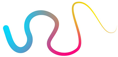
The DIY gradient usually involves two colors transitioning across the text or the icon, or sometimes both simultaneously, which can look very impressive on a computer screen at full size and becomes a complete disaster the moment it is printed in one color, embroidered on a shirt, or reproduced in any context that does not support full color digital display. Professional logos are not only designed in their original full parade of colors, but also designed to work in one color, in black and white, reversed out of a dark background, at favicon size, at billboard size... in every context the logo will ever appear. A gradient logo that only works in full color digital display is not a finished logo. It is a logo waiting to become a grown-up and a problem at the exact moment you least need one.
We speak from experience. We have seen the embroidery, and the embroiderer was at least polite about it. The outcome... not great.
The Everything Logo
(The logo containing the business name, the tagline, the icon, the founding year, a decorative border, the location, and, in one memorable case, we have personally witnessed, a small American flag).
The Everything Logo comes from a generous impulse. There is a lot to communicate about the business, and the logo seems like a reasonable place to do it. The name goes in. Then the tagline, because it took a long time to write, and it really captures the brand. Then an icon because it needed a visual element. Then the founding year, because longevity is a selling point. Then, a decorative frame because the whole thing needed to feel finished and complete.
The result is a logo that works at no size. At large sizes it is overwhelming. At small sizes it becomes an unreadable block of compressed information. At favicon size it is essentially a small square of visual noise. At one color it loses everything that was holding it together visually. And in every context it communicates the same thing: there was no editing process here. Everything that could go in, went in, because nobody said stop.

The most powerful logos in the world are almost violently simple. Nike's swoosh. Apple's apple. The Mercedes star. They work because they are so reduced, so confident in a single idea, that they communicate everything through what they chose to leave out. Simplicity in a logo is not a budget constraint. It is a strategic decision that requires more skill and more thinking than complexity. Knowing what to take out is significantly harder than knowing what to put in... and it is also significantly more valuable. We think about this every time we look at our own logo and resist the urge to add yet another something else to it. Which is more often than you might think.
The Twinsies Logo
(The logo that looks familiar because it is. Someone else made the same choices from the same template library and is currently running their business with essentially the same logo somewhere in the same market).
This is the tell that tends to produce the most immediate and visceral reaction when business owners encounter it for the first time.
DIY logo platforms work by offering templates and elements that are available to everyone who uses the platform. Which means every choice made from a template is a choice that every other user of that service could also make. And when tens of millions of businesses are using the same platform and working from the same library of icons, fonts, and layouts, the probability of producing something genuinely unique is vanishingly small.
Canva, for example, is used by over 190 million people. Yes, that's an obscene amount of people. Their template library contains hundreds of logo options. The math on uniqueness is not encouraging, and the legal implications are considerably more alarming than most people realize until it is already a problem.
SOMETHING MOST PEOPLE DON'T KNOW UNTIL IT'S TOO LATE
You cannot trademark a logo built from Canva's stock elements. Canva's own terms of service specify that their elements are licensed for use, not sold exclusively, which means they cannot be registered as a trademark. If your logo uses any of Canva's stock icons, fonts, or layout templates and you ever try to legally protect it as your business grows... it will be rejected. Someone else can use the same elements tomorrow, and you will have no legal recourse whatsoever. This is not a theoretical risk. It is a documented limitation that catches business owners completely off guard at the exact moment they can least afford a surprise. We are telling you now so it does not have to be a surprise later.
The twin logo problem is not just about looking similar to a competitor. It is about the fundamental impossibility of building brand equity in a logo mark that does not belong exclusively to you. Every impression of that logo is an impression that could theoretically be building someone else's brand recognition simultaneously. That is not how brand building is supposed to work.
And now, the newest member of the DIY logo family: the AI-generated logo
We would be doing you a genuine disservice if we wrote this post in 2026 and did not talk about AI logo generators, because they are everywhere, getting better remarkably fast, and a growing number of businesses are using them without fully understanding what they are and what they are not getting when the file downloads.
To be clear upfront: we have occasionally used AI tools in our own work, and we think they can possibly have a real and legitimate role in the creative process as a thinking partner, a thought starter, and a way to push ideas somewhere a human alone might not have tried. We are not here to have the AI is bad debate. That could take all night, and dare we say there are some seriously strong opinions about it on both sides. As far as logos are concerned, the issue is that it's becoming a powerful tool that is increasingly being used as a finished product in contexts where it is not actually a finished product... and that specific gap is where the problems live.
The AI Logo
(Generated in forty-five seconds from a three-word prompt. Looks surprisingly professional on a screen. Contains several legal and technical problems that will not surface until an incredibly and deeply inconvenient moment).
The US Copyright Office has ruled that AI-generated works lack human authorship and therefore cannot be copyrighted. A logo designed by a human can be both trademarked and copyrighted. A logo generated entirely by AI can potentially be trademarked but cannot be copyrighted. The practical gap between those two forms of protection means someone can copy your AI-generated logo in a non-commercial context, and you have zero recourse. Zip, zero, zilch. They just can; Legally, while you sit with a bowl of popcorn and watch.

Beyond the copyright gap, the AI generating your logo was trained on existing work from across the internet, which means there is a real possibility your logo bears an unintentional resemblance to a protected design. Ouch...rude, hard to accept, but totally true. And nobody involved would know it, because the AI was not checking the trademark registry when it generated your file. It was pattern matching. Those are two very different activities, and only one of them comes with potential legal liability attached.
And then there is the file format problem, which is less legally alarming and more immediately practical and honestly just as frustrating in its own way. AI logo generators produce pixel-based files, JPGs and PNGs, not the scalable vector files that allow a professional logo to go from the size of a postage stamp to the size of a building without losing a single crisp edge. An AI logo that looks sharp and clean on your laptop screen will look soft and slightly apologetic on a banner. On a billboard, it will look like someone photographed it through a window that hadn't been cleaned in 3 years and 4 pollen seasons. The embroiderer calls again. They are still polite, but the outcome is still the same.
None of this means AI has no role in a logo process, because it can. A skilled designer using AI to rapidly explore directions, generate reference concepts, or push their thinking somewhere unexpected is using it exactly as it should be used: as a tool in the hands of someone who knows what a finished, legally protectable, technically reproducible, embroidery-surviving logo actually requires. Forty-five seconds is a genuinely useful amount of time to generate some thought starters to get those creative minds warmed up. It is just not enough time to build a brand asset that needs to represent your business for the next decade across every surface and format it will ever appear on. The problem is not the AI. The problem is stopping at the download screen and calling it done.
"An AI logo that looks sharp and clean on your laptop screen will look soft and slightly apologetic on a banner. On a billboard, it will look like someone photographed it through a window that hadn't been cleaned in 3 years and 4 pollen seasons."
Let's get down to the numbers... because they're worth knowing.
Before we get to what to do about any of this, here are a few statistics that put the stakes of the logo conversation into proper context.
This is your first impression window. The logo is doing all the work in that split-second moment, and nobody is reading the tagline yet.
The percentage of consumers who actively avoid brands that look behind the times, equating poor design directly with poor quality.
Revenue increase linked to consistent logo use across all touchpoints. Consistency is not just aesthetic; it compounds financially.
Impressions before a logo becomes familiar. If those impressions are working against you, you've built the wrong brand recognition.
That last one is the one we come back to most often, because every time your logo appears anywhere, an impression is being made... and those impressions stack and compound into something over time. The only question worth asking is whether what they are building is actually what you want built.
Signs your logo might be ready for a professional conversation
The last word from the agency with the lightbulb that some people think is a pretzel
Nobody planned a bad logo, and that really is the most important thing to keep holding onto through all of this. The circumstances that produce them are almost always understandable, and the people who made them were doing the best they could with what they had at the time, which is exactly the right thing to do when you are launching a business and the logo is not the worst headache of the week.
But, the logo is out there right now. Making impressions in one tenth of a second, stacking toward that fifth or sixth view where it either becomes familiar and trustworthy or familiar and slightly off. It's telling people something about the business before a single word is read. The only question worth asking is whether it's telling them what you actually want them to know.
If the answer is yes, hooray! Nothing here applies, and you can send this to someone it does apply to, which is a deeply satisfying position to be in.
If the answer is no, or maybe, sorta, kinda, or we have been meaning to look at that since approximately 2009, the conversation is easy to start. It ends with something that is unmistakably, exclusively, legally protectable, and embroidery-compatibly yours. We have had that conversation hundreds of times. It is genuinely one of our favorites.
— Triple e Digital, Clearwater, FL. Brand identity designers, logo strategists, and proud owners of a logo that is definitely a lightbulb and not a pretzel.
