
BRANDING
FONT PERSONALITY GUIDE
Fonts that Lie and the Brands That Trust Them.
May 16, 2026 · 7 min read

What Your Brand Typography Is Actually Saying About You
Somewhere out there, right now, a perfectly good business is being quietly undermined by its font.
Not by its pricing. Not by its product. Not by a bad review, a slow website, or even a logo that could use some work. By the font. The thing someone picked on a Tuesday afternoon, probably from a dropdown menu, probably while also eating lunch, and definitely without fully understanding what they were agreeing to.
Because here's the thing nobody tells you when you're building a brand: fonts have personalities. Strong ones. Opinions, even. And when you put a font out into the world on your behalf, it starts talking. It tells people things about you before you've said a single word. It makes promises you may not have intended to keep. It sets expectations that your actual business might spend years trying to either live up to or quietly walk back.
This is the story of those fonts. The ones that seemed fine. the ones everyone trusted with that "girl next door" personality. The ones that have been out there, in the world, representing brands in ways nobody approved. We highly suggest reading their profiles before you make any spur-of-the-moment "I Do" commitments.

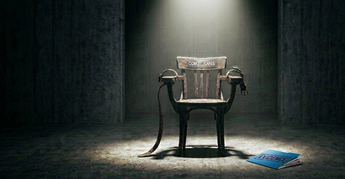
Let's get this one out of the way first because Comic Sans is the one everyone knew we had to bring up.
Comic Sans was designed in 1994 by Vincent Connare, a typographer at Microsoft, who created it specifically for speech bubbles in a cartoon dog software program called Microsoft Bob. It was never intended to show up on hospital signage, law firm websites, restaurant menus, or, and we are not making this up, the official communication from CERN the day they announced the discovery of the Higgs boson particle. One of the most significant scientific discoveries in human history. We're still processing that one.
Here's the complicated truth about Comic Sans, though: it is not actually a bad font for what it was designed to do. It's friendly, it's legible at small sizes, and there's real research suggesting it can help people with dyslexia read more easily. It has a place in the world. That place is just not on your business card, your annual report, or anything you'd like someone to take seriously at a glance.
What Comic Sans says about your brand, whether you meant it to or not: "We're fun! Approachable! Don't be intimidated!" What the person reading it actually hears: "We chose this in five minutes, and nobody pushed back." It's the font equivalent of showing up to a job interview in a novelty tie. Great conversation starter. Probably not the impression you were going for.
If your brand genuinely is playful, child-focused, or intentionally irreverent, there are fonts that will communicate that with a lot more craft and intention. We're happy to introduce you to some of them. They're very nice. They don't have this kind of baggage.
Papyrus is the font that wants you to believe it has a story.
It was designed in 1982 by Chris Costello, who drew it by hand on textured paper to evoke the feeling of ancient manuscripts and faraway lands. And in 1982, when it was new and nobody had seen it before, it probably did exactly that. Then the 1990s happened. Then desktop publishing happened. Then every spa, yoga studio, holistic wellness brand, Egyptian-themed restaurant, and fantasy novel cover in the Western hemisphere happened... and Papyrus never really recovered its dignity.
You may remember that Papyrus was the font chosen for the original Avatar movie logo. The highest-grossing film in history at the time. A movie with a reported production budget of 237 million dollars. And they used Papyrus. Ryan Gosling did a full Saturday Night Live sketch about it in 2017, where his character has an all-consuming, life-ruining breakdown over this exact choice, and the sketch went viral because millions of people saw it and thought "finally, someone said it."
What Papyrus says about your brand: "We are earthy, ancient, and full of wisdom." What the person reading it actually thinks: "I wonder if they also have a dream catcher in the lobby." It's not that Papyrus is ugly exactly. It's that it's been used so indiscriminately for so long that it no longer carries any of the meaning it was designed to carry. It just looks like a choice someone made when they wanted to seem earthy and interesting but ran out of time to actually be interesting.
Curlz MT exists. That's about as generous as we're prepared to be.
It was designed in 1995 and it has the visual energy of a birthday party invitation for a nine-year-old, which is exactly the context in which it should appear and nowhere else, ever, under any circumstances, including but not limited to: business names, storefronts, websites, menus, flyers, vehicle wraps, or anything you would like a person over the age of eleven to take at face value.
We have seen Curlz MT on real estate signs. We have seen it on the side of a food truck. We have seen it on a dental office window and spent the rest of that afternoon quietly staring into the middle distance, wondering about the choices that led there. The font itself is not the problem. The problem is the complete mismatch between what Curlz MT communicates and what literally any legitimate business is trying to communicate. Every font has a personality. Curlz MT's personality is "birthday cake" and it is extremely committed to that personality in every situation, regardless of context. Respect the commitment. Deploy it accordingly.
Times New Roman is not a bad font. It is, in fact, a genuinely excellent font for exactly one thing: long-form documents that will be printed and read on paper. Academic papers. Legal briefs. Novels. Things that need to be read in volume, in ink, at a comfortable pace. For those things, Times New Roman is a quiet workhorse, and it deserves its reputation.
For your brand, though... Times New Roman is sending a message you probably didn't mean to send. It says "default." It says, "I opened a document and didn't change anything." And in a world where your brand's visual identity is doing enormous amounts of work before anyone reads a word you've written, "default" is a very expensive thing to accidentally communicate.
It's a little like showing up to meet a client wearing the free t-shirt you got at a 5K three years ago. Perfectly fine clothing. Clean, even. But it doesn't say anything intentional about you, and intentional is exactly what branding is supposed to be. If that genuinely is your brand personality, there are serif fonts that communicate it with a lot more character and a lot less "I found this on a government form." We're happy to point you in the right direction.
Helvetica is the font that typography people love unconditionally and argue about constantly. There is an entire documentary about it, an actual feature-length film called Helvetica that came out in 2007, was screened at film festivals, and is genuinely compelling if you are the kind of person who finds themselves having strong feelings about letter spacing. We are those people. We own it.
Helvetica is clean. Neutral. Endlessly legible. It's been used by American Airlines, BMW, Jeep, the New York City subway system, NASA, and about ten thousand other organizations across every possible industry, which is both its greatest strength and its sneakiest weakness. When everyone uses the same font, the font stops communicating anything distinctive about any of them. Helvetica is so good at being inoffensive that it can make your brand feel like it belongs to no particular category, no particular personality, and no particular moment in time... which sounds like a compliment until you realize that "impossible to offend" and "impossible to remember" are basically the same thing from a branding perspective.
If your brand genuinely values clarity, precision, and modernity, Helvetica might be exactly right for you. The question to ask is whether it's a deliberate choice or a default one. Because there's an enormous difference between choosing Helvetica because it perfectly expresses your brand's personality and choosing Helvetica because it was already there and looked fine enough. One of those is a brand decision. The other one is a Tuesday afternoon.
So, How Do You Know If Your Font Is Lying To You?
Ask yourself a few questions and be genuinely honest with the answers. If someone saw your font with no other context, no logo, no color, no product, just the letterforms themselves, what would they assume about your business? Would they guess correctly? Or would there be a gap between the personality they perceived and the one you've been trying to communicate?
Did you choose your font intentionally, or did you choose it because it was already there, because it was free, and you were in a hurry? There's no shame in that answer, by the way. Most fonts end up in brands that way. But knowing it is the first step toward fixing it.
Has your business grown or evolved since you picked your current font? Brands change. Audiences shift. Positioning matures. The font that made sense for the version of your business you were running three years ago might be actively working against the version you're running now.
And finally: does your font feel like you? Not your business in the abstract, but you specifically. Your personality, your approach, the way you talk to customers, the experience you want people to have from the very first moment they encounter your brand. Does the typography match that? Or is there a mismatch between how your business feels in person and how it looks on paper? If you're sitting with any of these questions and feeling a little uncomfortable... that's actually a really good sign. It means you're paying attention. And paying attention is exactly where better branding starts.
The Last Word on Fonts That Lie
Typography is one of those things that operates mostly below the level of conscious thought. People don't walk up to your storefront and think, "That's an interesting serif choice." They just feel something. Trustworthy, or not. Polished, or not. Like a business that paid attention to detail... or like a business that picked something from a dropdown menu in 30 seconds.
That feeling happens fast. Faster than you'd think. And it sticks. The fonts that lie aren't lying because they're bad fonts. They're lying because they're saying something your brand never intended to say, to an audience that's absorbing every signal before they've decided whether to stick around or keep scrolling.
To be perfectly clear, we swear we're not mean and evil people. We're truthfully pretty chill and friendly. Occasionally, we do have strong feels about font choices, and for that, we apologize, and we certainly don't mean any harm. Most of all we apologize to our families for the countless font critiques of every holiday card and restaurant menu. We can't help it, it just happens. If you do happen to use any of the above fonts and you feel they best represent you or your brand, then that's great. Embrace it, enjoy it, and we're happy for you. But, if you're like many others who selected them for your brand, just because it was simple or you were in a rush, then perhaps you'll reconsider them.
The good news is that typography is completely fixable. It's one of the highest return investments in your visual brand because it affects literally everything that carries your name. Your website. Your packaging. Your signage. Your social media, and even your logo font. Every touchpoint is shaped by a decision that probably took less than five minutes to make and can be revisited with the right conversation and a little bit of honesty.
If your font is lying to you... It's time for a chat. We like those.
— The team at Triple e Digital, Clearwater FL. We choose fonts on purpose, every single time... Sometimes even Helvetica.
