
PACKAGING
TIME FOR A CHECKUP
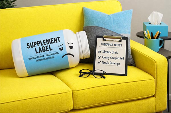
Your Supplement Label Has Been Referred to a Therapist.
May 14, 2026 · 12 min read

We Need to Talk About Your Supplement Label.
Walk into any supplement aisle in any health food store in America right now and take a slow look around.
Go ahead. We'll wait...
What you are looking at is one of the most visually chaotic retail environments in the history of consumer packaged goods. Hundreds of products. Thousands of claims. Dozens of brands all screaming simultaneously about their superior bioavailability, their third-party testing, their grass-fed this and their keto-friendly that, their founder's personal wellness journey, their proprietary blend, their clinical dosing, their NSF certification, their non-GMO status, their gluten-free formula, and in at least one memorable case we've personally witnessed, a very small photo of a mountain.
And somewhere in the middle of all of that noise... is your product.
The supplement market reached an estimated $209 billion globally in 2025. It is projected to surpass $414 billion by 2033, which means more brands, more products, more labels, and more noise than ever before competing for the attention of a shopper who has three seconds... and a list.
Three seconds. That is the average time a shopper takes to decide whether to pick something up or walk past. Not three minutes, not thirty seconds. Three seconds. In those three seconds, your label is either earning attention or losing the sale to the thing next to it on the shelf. And we have spent 30 years watching brands make the same avoidable mistakes in those three seconds over and over again with such committed consistency that we felt a deep moral obligation to write this post.
Consider it an intervention. A loving one. With bad humor, and therapists. Several of them.
The supplement label personality types. You may recognize some of these. You may even be one of them.
In the spirit of our ongoing commitment to telling the truth with humor and then offering to fix the problem, we present the definitive personality profiles of supplement label archetypes. Each one comes with a therapy session transcript because, honestly, some of these labels need professional help more than they need a rebrand. Some may even need both.
If you see your current label in any of these profiles... keep reading. We know people who can help. If your supplement label design is flawless and brings giant smiles to the suits at the FDA, then we hope we can at least make you giggle.
"The Overclaimer"
You have seen The Overclaimer. You have possibly been The Overclaimer. The Overclaimer's front panel is a complete census of everything the product does, everything it doesn't contain, every certification it has earned, every claim it is legally permitted to make, and a few it is perhaps pushing the boundary on. It is all there. All of it. At the same time. In eleven different font sizes.
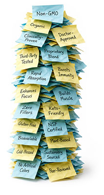
The thinking behind The Overclaimer is completely understandable. You worked hard on this formula. You sourced quality ingredients. You got the certifications. You ran the testing. You have things to say, and by goodness, you are going to say all of them on the front panel because you paid for all of them, and the customer deserves to know. Every last thing. Right now, in the three seconds they're standing in the aisle.
Here is the problem. When everything is important, nothing is. The human eye, faced with seventeen equally emphasized pieces of information, does one thing with remarkable consistency: it moves on. Not because the shopper isn't interested. Because the label gave them no clear place to start and no obvious reason to stop. The supplement next to yours just got picked up instead. Not because it's better, but because it was easier to understand in three seconds. Because what matters the most on the front panel was the easiest to see.
The brutal irony of The Overclaimer is that it works so hard to communicate value that it ends up communicating none of it clearly. More information is not more persuasive. More information is just more noise in a place that is already very, very noisy.
"The Minimalist Who Went Too Far"
Someone on the founding team discovered that RXBAR put their ingredients on the front and became enormously successful. Someone else watched one too many Apple product launch videos. A third person had a very strong opinion about white space. And The Minimalist Who Went Too Far was born.
The label has the product name. The product name is one word, and it is in a very thin sans-serif font. There is a lot of white space; there may even be a small geometric shape in a muted color. There may or may not be a very subtle texture, and it looks extraordinary on Instagram. It looks genuinely beautiful on a white surface in good lighting. And it sits on a retail shelf next to thirty other products and communicates approximately nothing to the person standing there trying to decide whether this might help with their joint pain, their sleep, or their protein intake.
Minimalism in supplement packaging is not wrong. Done correctly, it is one of the most powerful tools available because it creates contrast in a noisy environment and signals confidence in a category full of shouting. But minimalism requires that the elements you do include work extremely hard. When it works, it is stunning. When it doesn't work, it looks like a label someone made in fifteen minutes in Microsoft Word.
White space is a tool, not a product strategy. Silence is powerful in a room full of noise, but complete silence is just confusing.


"The Prescription Impersonator"
The thinking here is completely logical and produces completely counterproductive results. The brand wants to communicate science, credibility, and clinical efficacy. They want to stand apart from the brands that look like they were designed by someone who also sells crystals on the side. So they go clinical. Very clinical. White label, black text, technical font, perhaps even a periodic table reference. Molecular structure illustration. The word "advanced" is somewhere prominent. Possibly the word "formula."

And the shopper picks it up... and puts it back down... because it looks like something that should live in a cabinet behind the pharmacy counter rather than on an open retail shelf. The clinical aesthetic communicates science, but it also communicates "this is serious medicine" and "you probably need professional guidance to use this." None of which is the journey a supplement brand wants to send someone on while they're standing in Whole Foods on a Saturday morning just trying to sort out their magnesium situation.
Trust in the supplement category comes from clarity and confidence, not from looking like a hospital supply catalog. There is a meaningful difference between packaging that communicates scientific rigor and packaging that communicates pharmaceutical anxiety. The best science-forward supplement brands in 2026 have figured out how to feel credible without feeling clinical. It is a balance that requires real design skill, and it is absolutely worth getting right.
"The Wellness Cliché"
Soft sage green. Thin serif or script font. Leaf illustration. The word "clean." Possibly the word "pure." Maybe "ritual." Definitely "intentional." A small mountain, a wave, or a sunrise, depending on whether the brand skews outdoor wellness, coastal wellness, or morning wellness. A founder story involving a personal health journey. The phrase "crafted with care." Somewhere, a circle.

We are not describing one brand. We are describing approximately forty percent of the supplement and wellness labels currently on shelves across America. The Wellness Cliché is the packaging equivalent of a trend that started with one brave, genuinely distinctive brand and then got copied so many times that the original meaning has been completely diluted and what remains is a visual language that says "wellness" without saying anything specific about this brand, this product, or this particular reason a shopper should choose it over the eleven other sage-green-thin-serif labels within arm's reach.
The genuinely frustrating thing about The Wellness Cliché is that every element on its own is perfectly fine. Sage green is a beautiful color. Thin serifs or cursive fonts can be elegant. Leaves are simply lovely. The problem is not any individual choice. The problem is that when everyone makes the same choices, the choices stop communicating anything at all. Distinction requires actually being distinct. Which, in a category this crowded, requires the specific kind of courage that says "we are not going to look like everyone else even though everyone else looks like this because everyone else looks like this."
Plateau
"The Agressive Athlete"
The Aggressive Athlete knows exactly who it's for. It is for serious people, committed people. People who wake up at 4:45 am not because they have to, but because weakness disgusts them. The label is black, or very dark blue/grey. Or camo. The font is angular, and there are possibly lightning bolts. The word "BEAST" is not off the table. Neither is an illustration of something exploding. The product name is rendered in a typeface that has never once in its history been associated with anything gentle.
Here is the thing about The Aggressive Athlete: it used to work extremely well, and now it works in a much smaller slice of the market than brands using it seem to realize. The sports nutrition and performance supplement category has diversified enormously in the last decade. The buyer is no longer exclusively the 24-year-old male powerlifter. It's the 38-year-old woman training for her first marathon. It's the 50-year-old executive trying to maintain muscle mass. It's the weekend warrior who does cycling on Saturdays and yoga on Sundays and is increasingly uncomfortable picking up something that looks like it came with a warning label and a suggested soundtrack involving aggressive bass drops.
Intensity as a brand signal is not the problem. Intensity that alienates more of your potential audience than it attracts is a packaging strategy conversation that needs to happen before the next print run. Probably before the current one, honestly.
"The Founder's Passion Project"
We want to say something kind here because The Founder's Passion Project usually comes from a genuinely good place. The founder had a health journey. It was real and meaningful, and it changed their life and it is absolutely the reason this product exists. That story deserves to be told, and it is certainly a genuinely compelling brand asset. We absolutely adore hearing business owners' personal stories, and so does the public. The question is where it belongs on the packaging... and the answer is almost always not the front panel.

The front panel of your supplement has one job. Communicate what this product is, what it does, and why someone should pick it up in the time it takes to walk past it at a normal pace. The founder's photo does not help with any of those three things for a first-time shopper who has never heard of the brand. The founder's cursive signature does not help. The paragraph of origin story written in four-point type definitely does not help, and we say this with genuine affection for everyone who has ever written one.
Your story is an asset. Your face is an asset. Used correctly, founder-led branding builds enormous trust and loyalty. The front panel of a retail supplement product is not a memoir, though. It is a three-second sales pitch to a stranger who is also considering the eleven other things within arm's reach. The story goes on the website, the social channels, the back panel, the insert card, and the QR code experience. The front panel communicates the single most important thing about what's inside and then gets out of the way.
So, what does a supplement label that actually works look like?
It looks like someone asked the right questions before they designed anything. Not "what do we want to say" but "what does the shopper need to know in three seconds to reach for this instead of walking past it." Not "what are we proud of" but "what is the single most important thing about this product and how do we make that impossible to miss."
The supplement brands that are genuinely winning on shelf right now, in a market that hit $209 billion and is still climbing, have figured out a few things that separate their packaging from the noise around it. None of these things are secrets. All of them require discipline to execute because the pressure to add more is constant, and the courage to do less is genuinely hard to maintain when seventeen people in a room have seventeen opinions about what should be on the front panel.
- What is the one thing? One benefit. One claim. One reason to pick this up. Not five. Not three. One. If you can't identify it, the shopper definitely can't either and they are moving on.
- Does the shopper know what this is in three seconds? Cover the brand name. Hand the label to someone who's never seen it. Ask them what the product does. If they hesitate... the label needs work.
- Who is actually buying this? Not who you imagined buying it when you started. Who is actually standing in the aisle where this will live. Design for that specific person, not for a theoretical ideal customer who exists mainly in your pitch deck.
- What does the shelf look like around it? Your label doesn't exist in isolation. It exists next to thirty other labels. The thing that makes you stand out isn't necessarily what looks best alone. It's what creates contrast in context.
- Is this compliance or communication? Required information belongs on the label. It does not belong on the front panel competing with your hero message. Know the difference. Protect the front panel like it is premium real estate. Because it is.
- Does the finish match the promise? A premium supplement in cheap packaging communicates one thing regardless of what the label says. Matte finishes, soft-touch coatings, embossed details — these are brand signals that happen before the label is even read.
- What happens when the QR code gets scanned? 71% of US consumers find QR codes useful. Your QR code is not an afterthought. It is the bridge between what fits on the label and everything else your brand needs to say.
The Last Word on Supplement Aisle
The supplement market is not slowing down. $209 billion in 2025, heading toward $414 billion by 2033. More brands, more products, more labels, more noise. The shelf is only going to get more crowded, and the shopper's attention is only going to get more scarce. The three seconds you have to earn a pickup are not getting longer, no matter how much we all wish it would.
In that environment, the brands that win are not the ones that say the most. They are the ones that say the right thing, clearly, confidently, in a way that creates an instant connection with the specific person standing in that aisle holding that product for the first time.
That is not simple work. It requires real clarity about who you are and who you're for and what single idea your brand stands for at the moment of first contact. It requires the discipline to protect the front panel from everyone in the building who has a perfectly good reason to add one more thing to it. And it requires packaging that is as considered in its production as it is in its design, because a beautiful concept on the wrong substrate with the wrong finish communicates all the wrong things before anyone reads a single word.
We have been doing this for a really long time and we've worked on supplement packaging, protein packaging, wellness brands, functional food, and CPG products across pretty much every category you can think of. We have had the uncomfortable conversations. We have counted the claims on the front panels. We have stood in supplement aisles and watched shoppers walk past products that genuinely deserved to be picked up because the label didn't give them a reason to stop. Mostly because we're dedicated to our craft, also because perhaps we're a bit "unique" and that's just what we do for fun. Don't judge us.
We know what works. We know what doesn't. And we genuinely love the conversation that happens when a brand is finally ready to hear both. Dr. Turner, Dr. Moore, Dr. Prescott, Dr. Greenfield, Dr. Power, and Dr. Teller all agree.
— The team at Triple e Digital, Clearwater FL. Packaging designers, brand strategists, and reluctant experts on every type of supplement label crime currently being committed on retail shelves across America. We are here to help. So are the doctors. Ok, they're fictitious, but we're pretty sure you knew that already.